On the Recent Paintings of Alan Cote An Essay by Lydia Davis |
 |
|
Alan Cote is an abstract painter who lives and paints in an old brick school building, vintage 1930. His studio is the former auditorium/gym, where the community also used to gather in the evenings (coming in the side door) for talent shows and the like, the stage being at one end of the large space, up a few steps, now his office, while the deep and spacious main part of the room,where the little orchestra played and the audience sat, can accommodate comfortably his tall, double-sided drawing table, his three sturdy carts of paint cans, his rolling scaffolding, the stacked canvases leaning against the wall, and the one large wall on which he paints. The windows are lofty and ample and arched, filling the space with floods of northwestern light. Cats wander in and out, one, two, and three, sit on one or the other of the two large speakers and watch what he is doing, or settle to sleep on the sofa before a low table piled with books, or stretch out along the tops of the leaning canvases.
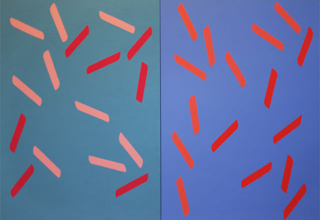
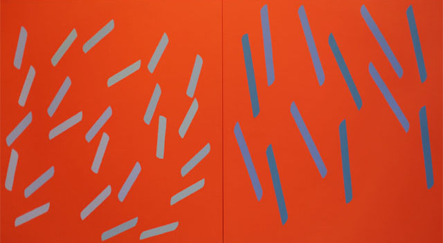
After fifteen years of the life of a New York City painter (Greenwich Street in Tribeca when that part of town was the fruit, vegetable, and dairy market district and rents were $200/month; when dealers sought painters instead of vice versa), Cote moved north a couple of hundred miles to live and work in a vast old tugboat shop that looked out on a tributary of the Hudson. In the early spring he could hear the ice booming; waterfowl nested in the rotten barge against the far bank. Now he has moved again, farther north and deeper in the country, at the edge of a rural village. Here he has increasingly concentrated his focus on what can be done within a few, consistent constraints. He finds there is great freedom within constraints, even, perhaps, more freedom than with no constraints at all. Cote's paintings have always been large, sometimes very large, occasionally filling an entire wall of a sizable gallery. He sometimes does a small or very small painting, but this is a rare departure. A number, at various times, of the earlier paintings were shaped canvases, but most of his paintings have been single rectangles or squares. Now, for the past two decades or so, he has been working with two-panel paintings. (This was a form in which he worked briefly some decades ago, and, oddly--as the painter has little control over the eventual fate of his work--some of those panels were sold separately, consigned to exist the rest of their lives on their own. One hangs, without its partner, in a college library. Its matching panel is in a museum collection; another he has reacquired and it leans against other paintings in his storage barn, while its partner is in a private collection somewhere out West.) This, then, is one consistent feature of Cote's recent paintings. Each of the two panels is painted with a colored ground, the colors of the two grounds being sometimes radically different; sometimes exactly the same, as in the orange/orange painting, Image #5 as reproduced here; and sometimes close in color and/or tone, as in the darker yellow/lighter yellow painting, Image#1, in which the two yellows converse and interact, the activity heightened because the tones are so close. 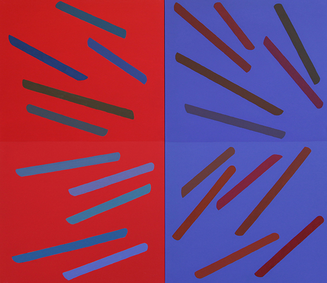 Why two panels rather than a single rectangle? What is the different effect of two panels on the viewer? Whereas the single canvas tends to act somewhat as a window, the viewer looking directly at and into the canvas, with the two-panel painting, the relationship is radically altered: there is interaction between the two panels, with viewer either as onlooker--some of the tension shifting from the relationship between viewer and painting to the relationship between the two panels--or as participant in a triangular relationship: panel to panel to viewer. Although the overall dimensions of the paintings change from one to the next, the two panels are always of the same dimensions. Another consistent feature has been the repeating shapes painted on the grounds, which could be called bars, but which Cote calls by a more neutral, and non-referential, name--elements. Cote sees the element as something between a line and a shape, and having some of the characteristics of both. For a time the elements were thinner, and precisely taped before being painted, whereas now the human hand is allowed a more visible presence. They are drawn directly on the ground in colored pencil, using a shaped cardboard guide. They are then painted freehand. The result is precise, geometrical, neat, but not mechanically precise, not ruler-straight; rather, there is the slightest imprecision in the straight line that subtly evokes the presence and motion, and the vulnerability, of the fallible human hand: they are not intended to be perfect. The ends of each element used to be sharper, and are now more curved; with a curving rather than sharp end, not only does the eye move more slowly as it traverses the painting, but the motion of the hand is also more apparent, thus the hand itself is more obviously present. The elements were for some years, in the 80s and early 90s, horizontal and vertical. Now, and for the last ten years, they are diagonal. The horizontal is a challenge because it often suggests landscape. Cote chose to free himself of that reference and work with the diagonal. The diagonal is inherently more unpredictable. It is alive, dynamic rather than static: there is more motion in it. "The painting has to have visual energy that is apparent. That visual energy is the necessity of a painting," he says. A panel of curved bands, for instance, may move up or down the canvas, but in either direction the bands move off the canvas and in so doing imply a larger form that becomes, beyond the canvas and in the mind of the viewer, a planetary form moving through a potentially infinite interplanetary space. Sometimes that motion is explosive, even dramatic, as in Image #4, with its divided grounds, longer elements, and more insistent motion in one direction (if we see them moving left to right); sometimes it is quieter, more meditative, the elements floating up the canvas and toward the space above, beyond the limits of the painting; or across the canvas; or drifting down, as in Image #6, with its shorter, relatively thicker elements, gentler colors, and random-seeming (not random in actuality, of course) placement on the ground. (Naturally, but also disconcertingly, one viewer will see motion up, another down, in the same elements.) These diagonals, painted as they are, could be seen as a geometric gestures. The angles of their placement are sometimes steeper and sometimes flatter, i.e. more toward the vertical or more toward the horizontal: the elements in the white/blue ground painting, Image #2, finished in April of this year, are the most horizontal that Cote has done in a long time. Most often, though not always, the elements are contained within the edges of the canvas, not touching the edges or moving off them either at the outer edges or at the center. Most often, each element is separate from the others, moving independently, though subtly associated with a limited number of others by the sharing of tone or color. 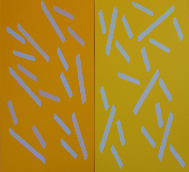 The elements are usually arranged symmetrically (in equal numbers) on the two panels, but not always. In Image #5, with its orange/orange grounds, for instance, a different balance is achieved: the elements on the right panel are twice as long as elements on left panel, but half in number. In Image #1, darker yellow/lighter yellow, they are asymmetrical in number but balance is achieved through the fact that the smaller number of elements, those on the left panel, have greater optical radiance. Thus, what changes from one painting to the next, besides the overall dimensions and the colors of the grounds, are the numbers and sizes of the elements, their placement on the canvas, their orientation, and, of course, their colors and tones. Another constant is Cote's manner of applying the paint that will form the ground: in many layers, but thin, even, and flat, rather than textured. Cote prepares the canvas by applying three coats of gesso before applying three or four coats of ground. What might seem a mechanical activity serves a purpose, which is to give him a deeply assimilated sense of the size, and the dimensions, of each panel. Cote's intention is that the paint should not call attention to itself, as it would in a more thickly applied, textured painted surface. He wants to avoid that distraction, toward texture, toward the paint, toward the gesture, toward the history of applying the paint, from his primary concern, which is attention to color and tone. Cote's primary interest is in color; along with placement; and the activity of the drawn in relation to the activity of the color. He is interested in the energy in color, and in realizing that energy, the life that is in color. What is its life? Its life is the emotion it conveys, since it is not being used to depict something. Though his paintings are not figurative, not about phenomena, do not depict things in the world, they are nevertheless about human relations and emotions, via the life and energy in color itself. What occurs in the process of developing the painting is this: in his preliminary drawings, which are done on a small scale and without color, and then through his color studies, which go through many changes before resolving in decisions about the placement and color of the elements, Cote "solves the problem" posed beforehand by the painting, he evolves an idea of what the painting will be; he decides upon the colors, tones, and placement of the elements in the painting; how to relate what is behind (that is, the ground) to what is in front (that is, the elements). He finds certain directions he wants the painting to take. This is done intuitively; he gravitates toward certain relations of color and tone. 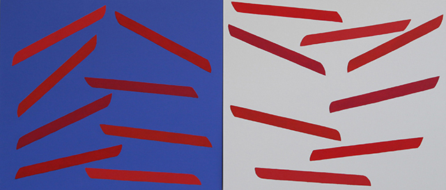 Then, as he actually engages in painting it, the painting once again opens itself to question; the painting changes, becomes active in determining its own evolution, refuses certain solutions, suggests others, evolves in unexpected directions. It grows from his observation of it, not from something outside of it. Cote thus works his way from the known into the unknown, and the painting, as a result, is new to him, a new presence. Even as he works with a set of choices similar to those of previous paintings, the painting must be, he says, a painting he has never done before. At the same time, Cote is working from disorder, in the process of the exploration, to order, in the finished outcome. "Logic should allow for illogic within it," he says. If what does not change, within the process of creating the painting, is the color of each ground, once determined, and the size and positioning of the elements on the ground, then what does change, over days and weeks, is the color and/or the tone of the elements. By organizing the placement of the elements beforehand, he allows for freedom in his use of color and tone. In some paintings, as in Image #4, the differences among the colors or tones of the elements are obvious; in others (for instance, in red white and blue), the elements on both panels contain the same colors, yet because the grounds are different, the colors of the elements also appear to be different. In one panel of a painting, though not the other--for instance, the right-hand panel of Image #6, or the left-hand panel of the black/reddish-brown Image #3-- the different tones of the elements are almost imperceptible at first (especially in reproduction, but even in the presence of the painting itself), and then gradually become more and more conspicuous the longer one continues to look, until they seem as obvious, in the end, as they were hard to perceive in the beginning. (But, says Cote, you don't have to know the colors are the same, you just have to experience what this does to you.) As the painting evolves, then, the color and/or tone of the elements changes; and in fact, in consequence, the ground itself, though its color and tone are not touched again once they have been applied, also changes in response to the changes in colors and tones of the elements applied on it. In some sense, all the preparation of the drawn elements and the colors of the grounds is done in preparation for then altering color and tone within the elements, to create the relationship between the elements and the grounds, and also, more surprisingly, between the two grounds. Each ground itself is active in the painting, its activity determined by the elements on the surface. Similarly, if the placement of an element seems wrong, a change in color can compensate, so that it no longer feels (or is) wrong. Conversely, Cote may establish symmetry in the different aspects of the painting, through sequences and sets of numbers, and then has the option of unbalancing it through the colors he puts on the elements. The painting, in the end, because of the use of color and tone, may feel unbalanced, working against the symmetry supplied by the drawn elements. Most complex, then, is this question of balance, the relation of symmetry and asymmetry in the paintings, the interplay of different kinds of balance between the numbers of elements, their sizes, and their colors. The two-panel structure itself implies, as a premise, a concern with balance, and the symmetry or asymmetry of the elements continues and complicates the preoccupation with balance. To look at balance or symmetry in a little more detail, in what is happening within a single painting: In the white/blue-ground painting with red-orange elements, Image #2, Cote worked from a series of decisions: about the horizontality of the diagonals, about the ground color choices of dark blue and pure white; about how long the elements should be. These particular diagonals appear almost horizontal. The lengths of the elements are the same on both panels, there are two sets of four each, with what seems like an "off" middle between the sets. There are three "spines": one implied vertical in the middle of each panel and one physical vertical where the two panels meet. Each set of four elements within each panel is of four different colors, but those colors repeat within each panel, though reversed in order: 4321 and 1234. The elements are asymmetrical in position, but symmetrical in number and color. They are deep in tone because the blue ground is deep in tone: the tones of the red-oranges need to be deep in order to be in the right relation to the deep blue, for us to sense that they have an attachment to the blue. (On a scale of 1 to 10, in depth, the elements would be 7 or 8.) The interaction of the elements and the grounds is contrapuntal: the blue comes to the red-oranges; the blue gives to the red-oranges and the red-oranges give to the blue at the same time as they set up an opposition to it. The white ground separates from the elements, pushes them out towards us, whereas the blue ground magnetizes the red-orange elements, so that they relate chromatically to it. They therefore relate both chromatically and contrapuntally. Because of the arrangement of the drawn elements, those on the blue ground appear to rise from the implied vertical between the two sets of four, whereas those on the white side appear to descend from the implied vertical. The ends of the elements on the left are tapered one way, the ends of the elements on the right are tapered the other way. Cote works with contrasts and oppositions: the balance of planned vs. intuitive or spontaneous; of disorder evolving into order; of measured versus rough; of ground and elements; of simplicity (of parts) vs. complexity (of the whole). The formal constraints are privately imposed; the results are then public. So it is within these repeated constraints that Cote explores what can be done--and perhaps the possibilities are infinite-- with depth versus surface, with activity, dynamism, symmetry, asymmetry, balance, with motion versus stasis, motion into and out from the canvas, motion up and down the canvas, convexity versus concavity of the painting, motion of the elements versus the ground, prominence of the elements versus the ground, using simple factors to create a complex work, and more. Viewers find the paintings electric. Some find that a painting appears convex, the middle coming out toward them: they walk up to the painting to make sure. Some viewers see the elements moving up, while others see them moving down, moving quickly or slowly. A painting of his has no particular narrative meaning or message, says Cote. You don't read it, you work on it visually. You have to look at it over time. You have to want it. It is like music, he says: we accept sound; are we willing to accept color--the way things look? That is harder. We are used to accepting music--it has always been abstract. |